Brand guide
Everything you need to write about uptive: the name, the logo, the colours and the story.
The name
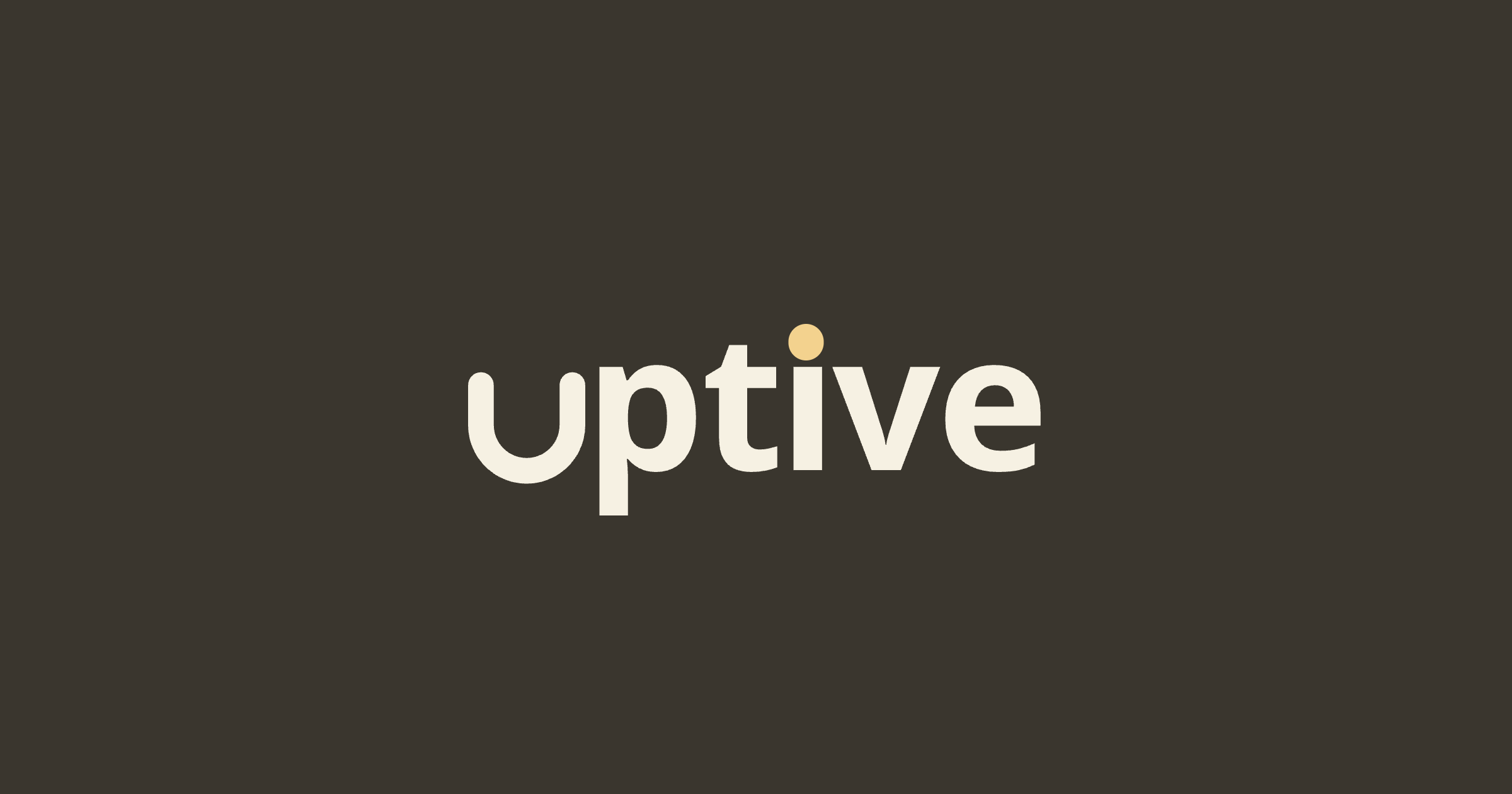
uptive is always written in lowercase. Also at the start of a sentence, in headings and in titles.
Logo
The u is a cup that catches the Boter dot; the dot lands on the i. Use the files below; do not recolour or redraw them.
Colours
Boter is for the dot and accents only: never large fields, never text on Papier.
- Ink#3A362E
- Boter#F3D28E
- Papier#F6F1E3
Type
Noto Sans, weights 400 to 900. Headlines are heavy (800–900) and tightly spaced.
Our story
uptive is a new kind of affiliate publisher. We build the sites, apps and channels people actually want to read, and connect that attention to partners honestly.
Downloads





Press
Writing about us? Email press@uptive.io.